前言
波浪效果需求可能在日常工作中会遇到,实现方法也很多,可以用Svg,也可以用Canvas,但是今天主要想实现的方法是通过Css来完成。

那Css怎么完成这种看似非常难实现的效果呢,其实用的是偏hack的办法,让我慢慢向你解释。
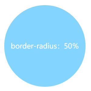
- 首先这是一个正常的圆。
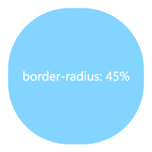
- 然后我们给它加点圆角。
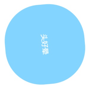
- 我们再加点动画让它转起来
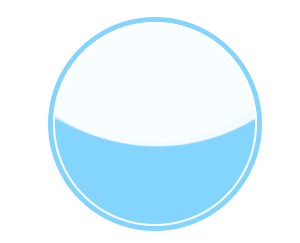
大家仔细看边缘部分的效果是否就可以用来模拟波浪效果呢,我们再稍加处理就能实现下面的效果:

source code:
        body {
            position: relative;
            min-height: 100vh;
            background-color: #76daff;
            overflow: hidden;
        }

        body:before,
        body:after {
            content: "";
            position: absolute;
            left: 50%;
            min-width: 300vw;
            min-height: 300vw;
            background-color: #fff;
            -webkit-animation-name: rotate;
            animation-name: rotate;
            -webkit-animation-iteration-count: infinite;
            animation-iteration-count: infinite;
            -webkit-animation-timing-function: linear;
            animation-timing-function: linear;
        }

        body:before {
            bottom: 15vh;
            border-radius: 45%;
            -webkit-animation-duration: 10s;
            animation-duration: 10s;
        }

        body:after {
            bottom: 12vh;
            opacity: .5;
            border-radius: 47%;
            -webkit-animation-duration: 10s;
            animation-duration: 10s;
        }

        @-webkit-keyframes rotate {
            0% {
                -webkit-transform: translate(-50%, 0) rotateZ(0deg);
                transform: translate(-50%, 0) rotateZ(0deg);
            }

            50% {
                -webkit-transform: translate(-50%, -2%) rotateZ(180deg);
                transform: translate(-50%, -2%) rotateZ(180deg);
            }

            100% {
                -webkit-transform: translate(-50%, 0%) rotateZ(360deg);
                transform: translate(-50%, 0%) rotateZ(360deg);
            }
        }

        @keyframes rotate {
            0% {
                -webkit-transform: translate(-50%, 0) rotateZ(0deg);
                transform: translate(-50%, 0) rotateZ(0deg);
            }

            50% {
                -webkit-transform: translate(-50%, -2%) rotateZ(180deg);
                transform: translate(-50%, -2%) rotateZ(180deg);
            }

            100% {
                -webkit-transform: translate(-50%, 0%) rotateZ(360deg);
                transform: translate(-50%, 0%) rotateZ(360deg);
            }
        }
其实就是利用不规则圆角的圆旋转的边缘再隐藏超出容器的部分,就能形成波浪效果的假象,下面我们补全代码:
source code:
//style

.container {
            position: absolute;
            width: 200px;
            height: 200px;
            padding: 2px;
            border: 5px solid #76daff;
            top: 50%;
            left: 50%;
            -webkit-transform: translate(-50%, -50%);
            transform: translate(-50%, -50%);
            border-radius: 50%;
            overflow: hidden;
        }

        .wave {
            position: relative;
            width: 200px;
            height: 200px;
            background-color: #76daff;
            border-radius: 50%;
        }

        .wave::before,
        .wave::after {
            content: "";
            position: absolute;
            width: 400px;
            height: 400px;
            top: 0;
            left: 50%;
            background-color: rgba(255, 255, 255, 0.4);
            border-radius: 45%;
            -webkit-transform: translate(-50%, -70%) rotate(0);
            transform: translate(-50%, -70%) rotate(0);
            -webkit-animation: rotate2 6s linear infinite;
            animation: rotate2 6s linear infinite;
            z-index: 10;
        }

        .wave::after {
            border-radius: 47%;
            background-color: rgba(255, 255, 255, 0.9);
            -webkit-transform: translate(-50%, -70%) rotate(0);
            transform: translate(-50%, -70%) rotate(0);
            -webkit-animation: rotate2 10s linear -5s infinite;
            animation: rotate2 10s linear -5s infinite;
            z-index: 20;
        }

        @-webkit-keyframes rotate2 {
            50% {
                -webkit-transform: translate(-50%, -73%) rotate(180deg);
                transform: translate(-50%, -73%) rotate(180deg);
            }

            100% {
                -webkit-transform: translate(-50%, -70%) rotate(360deg);
                transform: translate(-50%, -70%) rotate(360deg);
            }
        }

        @keyframes rotate2 {
            50% {
                -webkit-transform: translate(-50%, -73%) rotate(180deg);
                transform: translate(-50%, -73%) rotate(180deg);
            }

            100% {
                -webkit-transform: translate(-50%, -70%) rotate(360deg);
                transform: translate(-50%, -70%) rotate(360deg);
            }
        }

//html

<div class="container">
        <div class="wave"></div>
    </div>
总结
利用Css的transition和animation我们可以做出很多不可思议的动画,唯一限制你的就是你的想象,并且用Css制作出来的动画可以减少资源占用也有很好的流畅度,何乐而不为呢,另外推荐一位大神的博客,本篇文章也借鉴了他的一篇博文,戳这,一起学习一起成长吧!~
